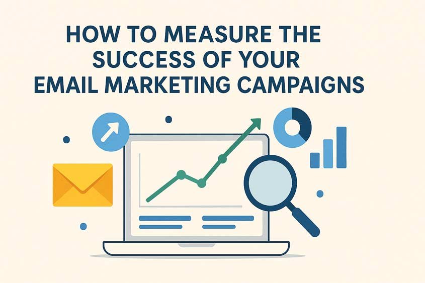
Why Measuring Email Marketing Campaigns Matters
Imagine spending weeks crafting the perfect email. The subject line sounds sharp, the visuals are polished, and the call to action is irresistible. You hit send, sit back, and wait for results. But how do you know if it actually worked? Without measurement, email marketing campaigns are a guessing game. You might reach thousands of inboxes, but unless you track performance, you can’t tell what’s driving engagement, conversions, or sales.
Email marketing is powerful, but only when data drives it. Measuring results turns campaigns from creative experiments into predictable growth systems. It helps you see what resonates, what fails, and what to adjust next. Every click, open, and conversion tells a story about your audience. The more precisely you listen, the better your campaigns perform.
Table of Contents
Marketers often assume success equals high open rates or big mailing lists. Those numbers matter, but they don’t tell the full story. A campaign with 50% open rates might still fail if no one clicks or buys. On the other hand, a smaller list with 15% opens could deliver steady sales. The difference lies in understanding what success means for your business—and measuring it correctly.
When you analyze your email marketing campaigns, you uncover how every part contributes to your goals. Subject lines affect open rates. Layout and visuals shape engagement. Timing influences conversions. Even small changes—like using a different button color or adjusting send times—can transform outcomes. The key is having reliable data that tells you why something works.
You can’t manage what you don’t measure. This principle applies to email marketing as much as finance or production. If you want higher returns, you need to treat campaigns like investments. Each email should have a measurable purpose—generate leads, nurture relationships, drive sales, or re-engage inactive users. Metrics then become your profit-and-loss statement.
Think of one example: a retail brand launches a spring sale campaign. They send three versions of the same email—each with a different subject line and call to action. Version A focuses on discounts, Version B on free shipping, and Version C on limited stock. After a week, they compare data. Version A gets the most opens. Version C drives the most clicks. Version B brings the most revenue. Without measurement, they’d never know which message actually converted. With it, they learn that urgency (limited stock) sparks engagement, but clear savings (discounts) win sales. That insight shapes every future campaign.
Measurement also protects your budget. Many marketers spend heavily on design tools, copywriters, or automation software, yet fail to track what works. When results don’t match expectations, they blame strategy instead of data gaps. A clear measurement system shows whether issues come from poor targeting, bad timing, weak content, or technical errors like deliverability. It saves time, prevents waste, and supports smarter decisions.
Modern email marketing runs on precision. Today’s tools allow you to track nearly every user interaction. You can see who opened your message, which links they clicked, how long they viewed it, and even what device they used. Combine that with automation and segmentation, and you can predict behavior patterns before sending the next campaign. Measurement turns raw numbers into strategic foresight.
Still, measurement isn’t about collecting endless data. It’s about finding what matters. The best marketers focus on a few key metrics that tie directly to business goals—open rates, click-through rates, conversions, and ROI. Everything else supports these core signals. Tracking them consistently builds a performance timeline, helping you identify patterns and forecast outcomes.
Measurement also bridges creativity and analytics. It shows writers, designers, and strategists how their work performs in the real world. A beautifully designed email might look impressive, but if subscribers ignore the call to action, it’s wasted effort. Likewise, a plain-text message might outperform everything else because it feels personal. Data reveals these truths without bias.
There’s also the human element. Every open or click represents a decision by a real person. Measuring success means understanding what motivated that choice. Did they trust your brand? Did they feel urgency? Did the offer align with their needs? The numbers point the way, but interpretation gives them meaning. That’s where marketers combine empathy with analytics.
Measurement builds credibility inside organizations. When you report results backed by data, decision-makers listen. You can show exactly how email campaigns contribute to pipeline growth, customer retention, or lifetime value. Instead of arguing for budget increases based on assumptions, you present hard numbers. It turns marketing from a cost center into a performance engine.
One overlooked advantage of measurement is learning speed. The faster you analyze performance, the faster you improve. Suppose your campaign’s click-through rate drops after a design change. By catching it early, you can reverse the change before losing engagement. Consistent tracking gives you that agility. Without it, small problems snowball.
Measurement also sharpens intuition. Over time, patterns repeat. You start predicting outcomes before running tests because you’ve seen similar trends before. That’s the mark of a mature marketer—someone whose instincts are trained by data, not guesswork.
There’s a psychological benefit, too. Measuring results turns abstract work into tangible progress. Seeing numbers move builds motivation. When you notice conversions rise after improving a call to action or adjusting send times, you understand your impact directly. It transforms marketing from routine execution into continuous learning.
Even so, many teams measure the wrong things. They track vanity metrics—like list size or impressions—that look impressive but mean little. True measurement focuses on actionable metrics that lead to real growth. The goal is not to collect data for data’s sake but to use it to refine strategy.
To make measurement meaningful, you need consistency. Tracking one campaign in detail and ignoring the next creates gaps. Each campaign adds a data point to your larger performance picture. Over time, this historical data shows trends—what times of year work best, which audiences respond most, and what types of offers perform consistently.
Email marketing campaigns thrive on iteration. You send, analyze, adjust, and resend. That cycle keeps improving results as long as measurement remains accurate. Good measurement doesn’t just tell you what happened—it guides your next move.
The reason measurement matters so much is simple: it closes the feedback loop. It connects creative effort with business results. Without it, marketing stays reactive. With it, you control outcomes. You turn uncertainty into insight. You transform campaigns from messages into measurable growth tools.
That’s the foundation of every successful email strategy: clarity through measurement.
Key Metrics to Track for Email Marketing Campaigns
Every strong email strategy relies on measurement. Numbers show what your audience reacts to, what drives sales, and where engagement fades. Without tracking, even the best-looking campaign is just a guess. To measure success properly, you need clear, consistent metrics that connect directly to your business goals. These metrics reveal whether your email marketing campaigns are performing as expected—and more importantly, why.
Open Rates and Subject Line Performance
Open rate measures how many recipients open your email out of the total delivered. It’s one of the first indicators of success, showing whether your subject line, sender name, and timing attract attention. If your emails go unopened, your message never gets seen, no matter how strong the content inside.
To calculate open rate:
Open Rate = (Number of Opens ÷ Number of Emails Delivered) × 100
If you send 10,000 emails and 2,400 are opened, your open rate is (2,400 ÷ 10,000) × 100 = 24%.
Across industries, average open rates range between 18% and 28%, according to Campaign Monitor’s 2024 data. But what matters more is your own baseline. If your average open rate rises over time, your subject lines are improving. If it drops, you may need to rework your approach.
Strong subject lines trigger curiosity or value. They stay short (under 45 characters), use clear language, and match your audience’s tone. Example: “Last Chance: 20% Off Ends Tonight” performs better than “Discount Offer Inside.” Personalization helps too. Emails using the recipient’s first name in the subject line see open rates rise by about 26%, based on data from Experian.
However, open rates are becoming less reliable. Apple’s Mail Privacy Protection (MPP) introduced in 2021 masks open tracking for many users. That means some opens get overcounted, while others disappear. To adjust, track open rates alongside other engagement metrics. The goal is not to chase a specific percentage but to detect patterns—what type of subjects consistently draw attention.
When testing subject lines, use A/B tests. Send two versions of your email to small audience segments. Whichever version gets the higher open rate becomes your main send. Over time, you’ll learn what tone, length, and structure perform best for your list.
Click-Through Rates and Engagement
Click-through rate (CTR) measures how many people clicked on links in your email. It’s a direct sign of engagement—proof that your content motivated action.
To calculate CTR:
CTR = (Number of Clicks ÷ Number of Emails Delivered) × 100
If you send 5,000 emails and 200 users click a link, your CTR is (200 ÷ 5,000) × 100 = 4%.
Average CTRs vary by industry, usually between 2% and 5%. High CTRs mean your offer, visuals, and call to action (CTA) align with your audience’s interests. Low CTRs suggest content mismatch or poor email design.
Here’s how to boost CTR:
- Use one clear CTA. Multiple links confuse readers. One button with a strong verb like “Get Started,” “Claim Offer,” or “Read More” performs better.
- Make CTAs visible. Use color contrast and sufficient spacing. People scan emails quickly; your CTA should stand out.
- Match message and landing page. If your email promises a free guide, the landing page should instantly deliver it. Any mismatch kills clicks.
- Add context with previews. Include a short line explaining why the link matters. Example: “See how top brands doubled conversions.”
CTR gives you a pulse on audience interest. If your opens are high but CTRs are low, your subject lines attract attention, but the content doesn’t keep it. That’s your cue to improve relevance, visuals, or offer clarity.
Conversion Rates and ROI
Conversion rate goes a step further—it measures how many recipients complete your desired action, such as purchasing, signing up, or downloading. This metric ties directly to revenue and campaign success.
To calculate conversion rate:
Conversion Rate = (Number of Conversions ÷ Number of Clicks) × 100
If 500 people click your link and 25 make a purchase, your conversion rate is (25 ÷ 500) × 100 = 5%.
High conversion rates prove your email content, offer, and landing page align perfectly. Low conversion rates signal friction—unclear CTAs, slow pages, or irrelevant offers.
Tracking ROI (Return on Investment) gives the full picture. Use this formula:
ROI = [(Total Revenue from Campaign – Total Cost of Campaign) ÷ Total Cost of Campaign] × 100
If a campaign earns €8,000 in sales and costs €2,000 to run, ROI = [(8,000 – 2,000) ÷ 2,000] × 100 = 300%.
ROI combines creative success with financial performance. It tells you whether your campaign’s impact justifies its cost. Over time, tracking ROI across multiple campaigns helps identify what types of content deliver the best value.
A/B testing again proves vital here. Try two offers—one focusing on discounts, another on free shipping. Track not just which gets more clicks, but which generates more purchases. Sometimes the version with fewer clicks produces higher revenue. That’s why conversion rate and ROI matter more than surface engagement.
Bounce Rates and List Quality
Bounce rate measures how many emails fail to reach inboxes. High bounce rates suggest list quality problems that can harm your sender reputation and reduce deliverability.
To calculate bounce rate:
Bounce Rate = (Number of Bounced Emails ÷ Number of Emails Sent) × 100
If you send 10,000 emails and 400 bounce, your bounce rate is (400 ÷ 10,000) × 100 = 4%.
There are two bounce types:
- Hard bounces: Permanent delivery failures (invalid address, closed account).
- Soft bounces: Temporary issues (full inbox, server error).
You should keep hard bounce rates below 2%. Anything higher signals outdated or poorly sourced contacts. Regularly clean your email list by removing inactive or invalid addresses. Most professional email platforms automate this process.
Maintaining good list hygiene protects your sender reputation. Internet service providers (ISPs) monitor bounce rates to assess trustworthiness. Consistent high bounces can push your emails into spam. Clean lists ensure accurate analytics—if your messages don’t reach inboxes, none of the other metrics matter.
Unsubscribe Rates and Subscriber Feedback
Unsubscribe rate measures how many recipients opt out after receiving your email. It’s not always bad news; sometimes it simply means your audience is refining itself. But a sudden spike signals a deeper problem.
To calculate unsubscribe rate:
Unsubscribe Rate = (Number of Unsubscribes ÷ Number of Emails Delivered) × 100
If 8 people unsubscribe out of 2,000 emails delivered, your rate is (8 ÷ 2,000) × 100 = 0.4%.
A healthy unsubscribe rate stays under 0.5%. Higher rates may mean:
- You’re emailing too often.
- Content isn’t relevant.
- Subscribers didn’t expect what they received.
Prevent high unsubscribes by setting expectations early. Tell users what kind of content they’ll get and how often. Offer preference centers so they can adjust frequency instead of leaving completely.
Subscriber feedback adds another layer of insight. Encourage replies or short surveys asking why someone unsubscribed or how emails could improve. That qualitative data explains what metrics alone can’t.
Many brands now track “negative engagement” metrics—like spam complaints or ignored emails. A rising complaint rate (above 0.1%) can threaten your deliverability. Use it as an early warning system that your tone, content, or frequency needs adjustment.
These five metrics—open rate, click-through rate, conversion rate, bounce rate, and unsubscribe rate—form the foundation of every performance review. Together, they show not just what your audience does, but how your campaigns create real business impact. Tracking them consistently gives you the clarity needed to improve strategy, sharpen targeting, and grow your results over time.
Tools and Platforms to Measure Email Marketing Campaigns
You can’t measure what you can’t track. The right tools make the difference between vague guesses and clear, actionable insights. Email marketing campaigns generate massive amounts of data—opens, clicks, conversions, and engagement over time—but you need structured platforms to collect and interpret it. Whether you’re using a built-in analytics dashboard or advanced third-party integrations, understanding your toolkit helps you turn raw numbers into meaningful strategy.
Email Service Provider Analytics
Every major email service provider (ESP) offers some form of built-in analytics. Platforms like Mailchimp, HubSpot, Klaviyo, ActiveCampaign, and Sendinblue collect performance data automatically. These dashboards show metrics like delivery rates, open and click-through rates, bounce rates, unsubscribes, and conversions.
These tools act as your campaign’s control center. You can view engagement trends, compare campaigns, and even visualize results through heatmaps or charts. For example, Mailchimp highlights which links attract the most clicks, showing how readers interact with your message. HubSpot ties email metrics to CRM data, connecting opens and clicks to leads and deals.
When reviewing analytics, focus on the essentials:
- Delivery performance: How many emails reached inboxes.
- Engagement metrics: Opens, clicks, and time spent reading.
- Audience growth: New subscribers, unsubscribes, and list churn.
- Conversions: Actions that align with your goals, such as purchases or sign-ups.
The advantage of using ESP analytics is simplicity. The data is immediate, visual, and directly linked to your campaigns. You can filter by segment, date, or automation type. However, each provider defines metrics slightly differently. For instance, Mailchimp may count a single user opening multiple times, while Klaviyo may track unique opens only. Always read your platform’s metric definitions before comparing data across tools.
Automation tools within ESPs also track performance by workflow. You can measure open and click rates per email within a drip sequence. This helps identify where engagement drops and which messages convert best. When you notice that a welcome email performs better than a follow-up, you can analyze why—timing, subject line, or offer relevance—and adjust accordingly.
Third-Party Analytics and Tracking Tools
Sometimes, built-in ESP analytics aren’t enough. If you want to dig deeper into user behavior or connect email data to your broader marketing ecosystem, third-party analytics tools offer advanced insights.
Google Analytics remains the most common choice. By adding UTM parameters to your email links, you can track exactly how users arrive at your website and what they do next. This data connects your email efforts to actual site behavior—page views, session time, and conversions. For example, you might discover that emails drive more traffic to your pricing page than social ads.
To set this up, use tags like:
utm_source=email&utm_medium=campaign&utm_campaign=spring_sale
Once configured, Google Analytics can show which email campaigns generate the highest engagement or sales. You can even compare email traffic to other channels.
Other tools like Hotjar or Microsoft Clarity record on-site behavior through heatmaps and scroll tracking. If you notice people clicking away from your landing page before completing a form, you can redesign it for better usability. This kind of behavioral data complements traditional email metrics.
Advanced analytics platforms such as Mixpanel, Amplitude, or Tableau let you merge email data with other channels, building a unified performance dashboard. These tools help large teams measure multi-step user journeys. For instance, you can track how many users opened an email, clicked, visited your site, and then made a purchase—all in one report.
If you use e-commerce integrations like Shopify or WooCommerce, you can connect sales directly to email campaigns. Klaviyo and Omnisend specialize in this. They show revenue per email, letting you identify which campaigns actually generate profit.
A/B Testing Tools
Testing separates assumption from reality. A/B testing tools allow you to experiment with variables like subject lines, visuals, send times, and CTAs. Most ESPs include built-in split testing features, but dedicated tools offer more precision.
In A/B testing, you send two versions of an email to small test groups. The version that performs better—based on opens, clicks, or conversions—goes to the rest of your audience. For example, you might test:
- “25% Off Ends Tonight” vs. “Limited Offer: Save 25% Now”
- A single image layout vs. a text-focused format
- Morning vs. evening send times
Let’s say version B of your email gets a 10% higher open rate and 20% more clicks. That tells you your subject line and content connected more effectively. Over time, you gather enough results to identify clear trends.
Some marketers use external A/B testing software like Optimizely or VWO (Visual Website Optimizer) for cross-channel experiments. These tools analyze statistical significance, ensuring your results are based on real differences rather than chance.
The key is consistency. Don’t test too many variables at once—focus on one element per test. Keep your sample size large enough to draw valid conclusions. And always record results in a shared document so your team builds a database of learnings over time.
Automation and Reporting Dashboards
Once your data grows, manual analysis becomes impractical. That’s where automation and reporting dashboards help. These platforms gather metrics from multiple sources—ESP analytics, Google Analytics, and CRM tools—and display them in one place.
Google Looker Studio (formerly Data Studio) is free and highly customizable. You can create dashboards showing open rates, click-throughs, conversions, and ROI side by side. Custom filters let you track performance by campaign, time period, or audience segment.
Other popular reporting tools include Databox, Cyfe, and Geckoboard. They pull data from Mailchimp, HubSpot, and other integrations automatically. Instead of exporting spreadsheets weekly, you get real-time visual updates.
Automated dashboards save hours and reduce error risk. They also improve team alignment. When everyone can see performance in one shared view, discussions shift from speculation to action. You’re not debating whose data is right—you’re analyzing what it means.
Dashboards also reveal trends over time. If your average open rate steadily climbs while click-throughs remain flat, you can pinpoint where engagement drops. That insight guides your next optimization step.
CRM and Data Integration Tools
Customer Relationship Management (CRM) systems connect email marketing to sales performance. Tools like Salesforce, Zoho CRM, or Pipedrive track every customer interaction—email opens, clicks, replies, and purchases—across the buyer journey.
When you sync your ESP with a CRM, you create a complete customer record. You can see which campaigns influenced each sale, when prospects engaged, and how long they took to convert. This is vital for B2B marketers tracking long sales cycles or multiple touchpoints.
Integration tools like Zapier or Make (formerly Integromat) automate this data flow. They connect your ESP, CRM, and analytics tools without custom code. For example, a Zap can log every email click into your CRM as a “lead interaction,” triggering a follow-up task for sales.
Using CRM-linked analytics helps personalize campaigns, too. You can segment audiences by purchase history or engagement score. When someone clicks but doesn’t buy, you can send a targeted follow-up sequence. This turns analytics into action.
In the end, the tools you choose depend on your goals and scale. Small teams can rely on ESP analytics and Google Analytics for robust tracking. Larger organizations benefit from integrated dashboards, CRMs, and predictive analytics systems. What matters is that your tools speak the same language—consistent, reliable data that reflects reality.
The stronger your measurement infrastructure, the faster you learn, adapt, and grow. Every tool in your stack should answer one question clearly: how well are your email marketing campaigns achieving their purpose?
ChatGPT said:
Interpreting Data to Optimize Email Marketing Campaigns
Tracking metrics gives you information. Interpreting those metrics gives you power. The numbers alone don’t improve results—you do, by understanding what they mean and turning them into action. Optimization begins when you connect data to decisions. Every open, click, and conversion reflects behavior. When you interpret that behavior accurately, you learn what your audience values, how they think, and what motivates them to act.
Identifying Trends and Patterns
Start by looking beyond individual campaigns. Single results can mislead you, but patterns tell the truth. Pull performance data from at least three months—or better, six. Notice how open rates, click-through rates, and conversions shift over time.
Maybe your open rates rise when you send emails midweek but drop on weekends. Maybe click-throughs spike when subject lines include urgency words like “today” or “now.” These recurring behaviors form trends, and trends reveal what works for your audience.
Visualization helps. Most platforms let you plot performance over time. A simple line chart showing opens and clicks per campaign can highlight upward or downward momentum. When you see consistent improvement, replicate what caused it. When you notice decline, isolate variables: Was the timing different? Did your list segment change? Was the offer weaker?
Seasonality also matters. Retailers often see engagement climb during holidays and dip in mid-summer. B2B marketers may notice higher activity during fiscal planning periods. Recognizing these rhythms allows you to schedule campaigns strategically rather than guessing.
Combine quantitative data (rates and percentages) with qualitative cues (subject line tone, image style, or content type). That blend of measurement and context produces actionable insight.
Segmenting Your Audience Based on Performance
Interpreting data properly means realizing not all subscribers behave alike. Segmentation is how you turn general performance into precise targeting.
Use your analytics to identify patterns in behavior:
- Highly engaged users open and click frequently.
- Inactive users haven’t interacted in months.
- New subscribers respond differently than long-term ones.
Now, create segments based on these insights. Send tailored content to each group. Highly engaged users might receive exclusive offers or loyalty rewards. Inactive users might get reactivation emails with clear incentives.
For example, a software company might find that trial users who click tutorials convert 50% more often than those who don’t. That insight suggests sending targeted follow-ups emphasizing product walkthroughs.
Segmentation also helps prevent unsubscribes. Instead of blasting every message to your full list, you focus on relevance. The more relevant the message, the lower your opt-out rates.
Your ESP or CRM can automate this process. Platforms like Klaviyo, ActiveCampaign, and HubSpot create dynamic segments that update automatically as user behavior changes. You can build triggers—if a user clicks a link but doesn’t purchase within three days, send a reminder email. That’s how interpretation becomes optimization.
Content and Design Adjustments
Data shows you what attracts attention and what gets ignored. When engagement drops, look at your email’s structure, tone, and visual layout. Sometimes a simple design change drives major improvement.
Start with subject lines. If open rates decline, test new formats: questions, personalization, or shorter phrasing. Review your top-performing subject lines from previous campaigns. Look for common traits—did they include numbers, deadlines, or emotional words?
Next, evaluate copy and visuals. High opens but low clicks mean the content didn’t fulfill the subject’s promise. Maybe the offer felt unclear or the layout made reading difficult.
Consider using heatmaps (available in tools like Mailchimp and HubSpot) to see where people click. If readers skip your CTA or abandon mid-scroll, adjust placement or clarity.
Keep paragraphs short, use strong headlines, and make CTAs visible and specific. Example: “Download the Free Report” performs better than “Learn More.”
Design also affects engagement. Overly complex layouts slow load times, especially on mobile. Since over 40% of email opens happen on smartphones, ensure responsive design. Test your email on multiple devices before sending.
Don’t ignore tone and storytelling. Data tells you what people do; tone tells you how they feel. If responses improve after more conversational or personal messaging, that’s a sign to lean into authenticity.
Timing and Frequency Optimization
Timing defines visibility. Even a perfect email fails if it lands when your audience isn’t looking. Your analytics reveal when people open and click most often.
Start with send-time reports from your ESP. You might find your audience opens most emails at 9 a.m. on Tuesdays but rarely at weekends. Those details guide scheduling.
However, timing isn’t universal. Retail customers, for instance, often check email at lunch or after work. Business audiences might open during weekday mornings. The only reliable way to find your best time is through testing. Send the same email at different hours to separate groups. Compare open and click rates.
Frequency also matters. Too few emails and your audience forgets you. Too many and they unsubscribe. Look at unsubscribe and spam complaint trends. A sudden rise suggests fatigue.
One practical metric: emails per subscriber per month. Many brands perform best between 2 and 6 sends monthly. Measure engagement and unsubscribes at each level to find your balance.
Data-backed timing creates predictability. When subscribers learn to expect your messages at consistent, relevant times, they’re more likely to engage.
Benchmarking Against Industry Standards
Interpreting your data in isolation limits context. Benchmarking compares your performance to industry averages, helping you see where you stand.
Sources like Campaign Monitor, Mailchimp, and HubSpot publish annual benchmark reports. These outline average open rates, CTRs, and unsubscribe rates by industry. For example:
- Retail: 18% open rate, 2.5% CTR
- Education: 28% open rate, 4% CTR
- Technology: 22% open rate, 2.8% CTR
If your open rate is 25% and you’re in retail, you’re above average. That’s encouraging. But if your CTR is 1%, you know engagement inside the email needs work.
Benchmarking also helps set realistic goals. Expecting a 50% open rate in a low-engagement industry leads to frustration. Understanding the range keeps expectations grounded.
Use benchmarks to identify improvement areas, not as rigid targets. Your audience, brand, and message mix are unique. The goal is steady progress, not chasing someone else’s numbers.
Connecting Metrics to Strategy
The most valuable insight comes when you connect metrics to specific decisions. Each performance indicator should guide one clear action.
For example:
- Open rates low → test new subject lines or adjust timing.
- CTR low → improve CTAs or email content relevance.
- Conversion rate low → optimize landing page experience.
- Bounce rate high → clean your email list.
- Unsubscribe rate high → review frequency and audience segmentation.
Track these cause-and-effect relationships over time. Build a measurement log. After several campaigns, patterns emerge that define your brand’s best practices.
Interpreting data also means knowing when to stop adjusting. Over-optimization can fragment your testing. Focus on trends that impact business goals directly—sales, leads, or retention—not vanity metrics.
When you interpret your email data thoughtfully, you turn static numbers into strategy. Patterns reveal audience preferences. Segments define communication style. Content and timing evolve with evidence, not assumptions.
Optimization isn’t a one-time task. It’s a cycle: analyze, adjust, test, and repeat. The more you refine your understanding, the more efficient your campaigns become. Data transforms from a report into a roadmap—one that leads to consistent growth and smarter decisions.
Common Mistakes to Avoid When Measuring Email Marketing Campaigns
Even skilled marketers make mistakes when tracking and analyzing email data. These errors distort results, waste time, and lead to poor decisions. Avoiding them protects accuracy and keeps your strategy effective.
Focusing on Vanity Metrics
Vanity metrics look impressive but don’t prove success. Examples include total emails sent, total opens, or list size. They show activity, not impact.
A large list doesn’t matter if most recipients don’t engage. A high open rate means little if few people click or convert. The goal is not to collect numbers but to understand behavior.
Replace vanity metrics with actionable ones:
- Click-to-open rate (CTOR) – shows how well your content converts interest into engagement.
- Conversion rate – reveals whether your emails achieve business goals like sales or sign-ups.
- Revenue per email (RPE) – measures direct financial impact.
These metrics connect directly to performance. They tell you what’s working and where to improve.
Ignoring Data Quality
Your analysis is only as good as your data. Poor data leads to false conclusions. Common quality issues include:
- Outdated or duplicate contacts
- Inaccurate tagging or segmentation
- Incomplete tracking setup
If tracking codes break or contact lists contain invalid emails, your reports misrepresent real performance.
Audit your data regularly. Check that analytics scripts work on all landing pages. Clean your list by removing inactive or bounced addresses. Platforms like ZeroBounce or NeverBounce help maintain list integrity.
Use consistent naming for campaigns and tags. “Newsletter_Jan” and “January_Newsletter” might represent the same campaign but fragment your data. A standard structure ensures clear tracking.
Overlooking Deliverability
You can’t analyze what people never receive. Deliverability often gets ignored, yet it affects every metric.
If your emails land in spam folders, open and click rates drop—even if your content is perfect. Common deliverability mistakes include:
- Using purchased lists
- Sending too frequently
- Lacking authentication (SPF, DKIM, DMARC)
- Including spam trigger words (“free,” “urgent,” “act now”)
Monitor your bounce rate and spam complaint rate. High numbers indicate deliverability trouble. Most ESPs include deliverability dashboards—use them.
Authenticate your domain through DNS records and keep sending patterns consistent. Avoid sudden volume spikes, which look suspicious to email filters.
Misinterpreting Metrics
Data shows what happened, not always why. Misreading metrics causes wrong conclusions.
Example: a high open rate might look positive, but if your click rate is low, it could mean your subject line attracted curiosity without delivering value. Similarly, a drop in opens might reflect list cleanup or timing changes, not failure.
Always view metrics together. Context converts raw data into insight.
- If opens rise and clicks rise too, your message improved.
- If opens rise but clicks fall, you may have overpromised.
- If conversions fall despite stable clicks, the issue lies on the landing page.
Document your hypotheses before testing. Record what change you made and what you expected. That discipline helps interpret outcomes accurately.
Neglecting Segmentation in Analysis
Averages can mislead. If you analyze results across your entire list, you miss differences between groups.
For instance, a 20% open rate might seem fair. But if your engaged users open at 40% and inactive users at 5%, treating them as one group hides opportunity.
Segment your reports just like your campaigns. Analyze by:
- Engagement level
- Customer lifecycle stage
- Geography
- Device type
This reveals where to focus improvement. Maybe mobile users struggle with design, or new subscribers respond better to educational content. Without segmentation, these insights stay hidden.
Ignoring Long-Term Trends
Short-term fluctuations mean little without trend context. One low-performing campaign might just coincide with holidays, slow weeks, or external events.
Look at rolling averages over time. Compare results month-to-month or quarter-to-quarter. Focus on direction, not isolated numbers.
If open rates slowly rise while click rates stay steady, it means your subject lines improved but content needs work. Without trend tracking, you might celebrate prematurely.
Consistency matters more than one-off success. Track cumulative progress. That’s what defines growth.
Failing to Connect Metrics to Business Goals
Email marketing doesn’t exist for clicks alone. It supports larger goals—sales, leads, or customer loyalty. Measuring only internal performance metrics creates a gap between marketing and revenue.
Always link campaign results to business outcomes. For example:
- How many new customers came from the email series?
- What percentage of total monthly sales came from email?
- How much revenue did each email generate?
Use Revenue per Email (RPE) or Customer Lifetime Value (CLV) metrics to close the loop between email engagement and financial results.
If a campaign earns fewer clicks but higher revenue, it’s a win. Context defines success.
Testing Too Many Variables at Once
A/B testing works only when you isolate one variable. Testing multiple changes simultaneously—subject line, CTA, and layout—makes results impossible to attribute.
If the test wins, you won’t know why. If it fails, you won’t know what caused it.
Follow a structured process:
- Test one variable.
- Set a measurable goal (e.g., increase CTR by 10%).
- Run the test with statistically significant data.
- Implement the winner, then test a new element.
Iterate slowly. Reliable insight beats quick guesses.
Neglecting Post-Click Behavior
Many marketers stop analyzing after the click. But real value happens after visitors leave the email.
If users click but don’t convert, review the landing page. Measure load time, design, and offer clarity. Tools like Google Analytics or Hotjar show how visitors interact after clicking.
Your email’s job is to drive action. If that action fails downstream, optimization must extend beyond the inbox.
Summary
Avoiding these mistakes turns raw data into reliable intelligence. Accurate tracking, proper interpretation, and disciplined testing produce truth—not illusion.
Focus on quality over quantity. Measure what matters to your goals. Keep data clean, contextual, and connected to outcomes.
Smart marketers don’t chase metrics. They study them, understand them, and act with precision. That’s how measurement becomes mastery.
How to Report and Communicate Email Marketing Results
Collecting data is only half the job. The real value comes when you translate that data into insights others can understand and act on. Clear reporting turns raw numbers into meaningful stories about performance, customer behavior, and business impact. Done well, it earns trust, secures budgets, and drives smarter strategy decisions across your organization.
Start with Purpose
Before building any report, define its purpose. Ask:
- Who will read it?
- What decisions will they make using this data?
- What level of detail do they need?
Executives want outcomes tied to revenue and growth. They care about ROI, customer acquisition, and conversion. Marketing managers want tactical metrics—open rates, CTR, unsubscribes—to refine campaigns. Designers or copywriters might focus on engagement data to test creative performance.
Tailoring your report to the audience prevents overload. You don’t need to show every chart. Include only what drives understanding and action.
A CEO might need one slide summarizing ROI trends. A marketing analyst might need a detailed breakdown of segments and A/B test outcomes. The right format depends on who reads it.
Choose the Right Metrics
Each report should focus on metrics that align with business goals. Avoid vanity data. Instead, connect campaign outcomes directly to measurable impact.
Key metrics to highlight:
- Open Rate: Measures initial engagement. Useful for subject line testing.
- Click-Through Rate (CTR): Indicates relevance of content.
- Conversion Rate: Shows whether emails meet campaign goals.
- Revenue per Email (RPE): Quantifies financial return.
- Unsubscribe and Complaint Rate: Tracks audience sentiment and fatigue.
For recurring reports, track these metrics over time. Trends matter more than single numbers. If CTR improves while unsubscribes increase, you may be engaging some users but alienating others. The relationship between metrics often reveals more than isolated data points.
Use Visuals Effectively
Charts communicate patterns faster than text. But clarity beats decoration. Keep visuals simple and purposeful.
Use:
- Line charts for trends over time (e.g., open rates per month).
- Bar charts for comparing categories (e.g., CTR by segment).
- Pie charts sparingly, only to show distribution (e.g., device usage).
Label axes clearly. Include percentage changes. Always show data sources and time frames.
Color should guide interpretation, not distract. For example, use green to mark improvement and red for declines. Maintain consistent visual language across all reports to help readers understand patterns instantly.
Provide Context
Numbers without context mislead. Always explain what influenced results. Did you change your sending schedule? Try a new design? Clean your list? External factors—holidays, product launches, or news events—also affect performance.
For example:
“Open rates increased by 12% compared to last month, likely due to shorter subject lines tested in Campaign B.”
That one sentence gives the data meaning and direction. It connects observation to action.
Include benchmarks when available. Compare your performance with past campaigns or industry averages. Context turns static numbers into insight.
Tell a Story
Every report should read like a short story: a beginning (the goal), a middle (what happened), and an end (what it means). Storytelling helps decision-makers see cause and effect.
Structure your narrative like this:
- Objective: What you wanted to achieve.
- Action: What you did (e.g., launched new series, changed design).
- Outcome: What the data shows.
- Interpretation: Why you think it happened.
- Next Steps: What you’ll do based on the insight.
This flow keeps your report logical and actionable. Data becomes evidence, not confusion.
Example:
“Our goal was to increase reactivation among dormant users. We tested a personalized subject line campaign. The open rate rose 25%, and conversion improved 9%. The data suggests personalization works. We’ll extend this approach to all re-engagement emails next quarter.”
That short explanation communicates clearly, even without charts.
Automate Where Possible
Manual reporting wastes time. Most email platforms—like Mailchimp, HubSpot, and ActiveCampaign—offer built-in dashboards and scheduled reports.
Set up automation for recurring updates: weekly engagement summaries, monthly conversion reports, or quarterly ROI analysis. Automation ensures consistency and eliminates human error.
You can integrate email data with analytics tools like Google Data Studio, Looker Studio, or Power BI for deeper insights. These tools allow dynamic dashboards where stakeholders can filter by segment, campaign, or date range.
Still, automation doesn’t replace interpretation. Automated numbers need human context. Review them before sharing.
Highlight Insights, Not Just Data
Reports often drown in numbers. To stand out, emphasize insights—what the data actually means for decisions.
Instead of saying:
“CTR was 3.2%, up 0.8% from last week.”
Say:
“CTR improved 0.8% after adding product images above the fold. This suggests visual hierarchy influenced engagement.”
Each metric should lead to a conclusion or recommendation. That’s how reporting drives action.
You can format key takeaways as short bullet points at the top:
- Subject line personalization improved open rates by 15%.
- Weekend sends outperformed weekdays by 12%.
- Conversion dropped on mobile, likely due to button placement.
This summary helps readers grasp the main insights quickly before diving into details.
Maintain Transparency
Honest reporting builds credibility. Show both wins and losses. Inflating results might please managers temporarily but damages trust long term.
If a campaign underperformed, explain why and how you’ll fix it. Decision-makers value honesty paired with solutions.
Example:
“Open rates dropped 10% due to deliverability issues from an unverified domain. The issue has been resolved by updating SPF and DKIM records.”
That’s accountability with progress.
Always disclose data sources and methodology. If metrics come from multiple platforms, clarify how you merged them. Transparency ensures consistency and trust.
Keep It Actionable
A good report always answers the question: “So what?”
For every insight, provide a next step. Example:
- “Low CTR—test different CTA placement next campaign.”
- “High unsubscribe rate—review frequency and tone.”
- “High mobile conversions—optimize layout for smaller screens.”
Action converts information into improvement. Without it, reports stay theoretical.
Present Live When Possible
If you share reports during meetings, walk your audience through the story. Highlight trends, not numbers. Use visuals to explain progress. Encourage questions.
Live presentation allows discussion, alignment, and strategy decisions on the spot. It also helps you gauge how non-technical stakeholders interpret your data. Their feedback improves future reports.
If presenting remotely, record a short walkthrough explaining main findings. Voice context helps more than text alone.
Build a Consistent Reporting Rhythm
Consistency builds reliability. Whether weekly, monthly, or quarterly, deliver reports on schedule. This rhythm allows teams to track progress and anticipate updates.
Use the same format each time. Stakeholders learn where to look for key insights, saving time. Over time, patterns become obvious, and strategic decisions grow faster.
Accurate reporting bridges the gap between data and action. When you present clear insights tied to real outcomes, you empower decision-makers.
Numbers alone don’t drive growth—understanding them does. A transparent, well-structured report transforms your email marketing campaigns from isolated messages into measurable business drivers.
Using Analytics Tools to Improve Email Marketing Campaigns
Email marketing campaigns depend on insight, not intuition. Analytics tools give you that insight. They turn raw numbers into meaningful patterns that guide strategy, content, and timing. When used correctly, these tools act as a constant feedback system—showing what’s effective, what’s not, and where you can improve next.
Marketers often use analytics reactively. They check open rates after sending or scan reports when results drop. But analytics should be active, not passive. You can use it before, during, and after each campaign to shape performance. Understanding how to do that—and which tools to trust—can transform how you plan and optimize email marketing.
Understanding What Email Analytics Tools Do
Analytics tools collect and interpret behavioral data from every stage of an email campaign. They show you how subscribers interact with messages, from opening and clicking to converting. Some tools also track the path users take after leaving the email—whether they visit your site, purchase, or abandon a cart.
At their core, these tools answer questions like:
- Who engages most often?
- Which content types drive conversions?
- What times and days perform best?
- How does email contribute to total revenue?
Every platform visualizes these answers differently, but the goal stays the same: understand what your audience does and why.
Key Analytics Tools and What They Offer
There are dozens of tools on the market, but several stand out for accuracy, ease of integration, and actionable insight.
- Google Analytics (GA4)
GA4 remains essential for understanding what happens after subscribers click your email. You can track sessions, bounce rates, and conversions tied directly to campaign links. By using UTM parameters (such as “utm_source=email”), GA4 identifies traffic from each campaign. This lets you calculate the true ROI of email marketing.
Example: If you sent 10,000 emails, got 500 clicks, and 50 purchases averaging €40 each, GA4 shows €2,000 in revenue. RPE = €2,000 ÷ 10,000 = €0.20. - Mailchimp Analytics
Mailchimp’s built-in dashboard tracks opens, clicks, unsubscribes, and social shares. It visualizes engagement per campaign and compares performance against past sends. Its audience analytics segment subscribers by activity—helping you identify who interacts most and who needs re-engagement. - HubSpot Email Analytics
HubSpot integrates email data with CRM behavior. You see how individual contacts respond to emails and how those actions influence lead scoring or sales. HubSpot’s strength lies in attribution—it shows which emails directly contribute to revenue or customer retention. - ActiveCampaign
Known for behavioral tracking, ActiveCampaign connects website and email data. It logs actions like product page visits, downloads, or form submissions, then adjusts automation triggers accordingly. It’s powerful for nurturing leads and identifying conversion signals. - Campaign Monitor
This platform provides clear, visual reports for teams who prefer simplicity. You can compare multiple campaigns side by side and see geographic heatmaps of engagement. It’s ideal for identifying timing and content preferences across different regions. - Litmus
Litmus focuses on pre-send testing and post-send analytics. It checks rendering across devices, spam filters, and load speed before launch. After sending, it analyzes engagement by device, reading time, and attention span—insight few other tools track. - Klaviyo
Klaviyo integrates deeply with ecommerce platforms like Shopify. It tracks customer lifetime value, purchase frequency, and browsing behavior. You can measure how automated email flows (abandoned carts, win-backs, product recommendations) drive revenue. - Omnisend
Built for ecommerce as well, Omnisend links email and SMS analytics. You can test multi-channel campaigns and see which message type converts best.
Each of these tools offers a different strength—some excel at CRM integration, others at visual reporting or predictive analytics. The right choice depends on your business model, data complexity, and marketing maturity.
Combining Tools for a Complete View
No single platform captures everything. The most accurate insights come from combining tools. A typical setup looks like this:
- Use your email service provider (ESP) to track opens, clicks, and unsubscribes.
- Use Google Analytics to track post-click behavior and conversions.
- Use CRM data (like HubSpot or Salesforce) to connect email actions with sales outcomes.
This integration gives you a full funnel view—from inbox engagement to revenue generation.
You can connect data through UTM tracking, API integration, or middleware like Zapier. The goal is a continuous feedback loop where email metrics inform sales data and vice versa.
How to Use Analytics for Continuous Improvement
Analytics tools become valuable when you act on what they reveal. Here’s how to use them strategically:
1. Identify Engagement Patterns
Use analytics to find when your audience is most responsive. Check which send times yield higher opens and clicks. Many platforms provide heatmaps showing engagement by hour or day.
If you discover your audience opens most emails at 8 AM on weekdays, schedule accordingly. Over time, adjust based on changes in behavior or region.
2. Test and Validate Assumptions
Analytics allows evidence-based testing. Suppose you think shorter subject lines improve open rates. Create two versions, track performance, and compare data. If the test confirms your hypothesis, implement it across campaigns.
Keep a log of every test result. Over time, this becomes a private dataset of proven tactics tailored to your audience.
3. Monitor Lifecycle Metrics
Go beyond single campaigns. Use analytics to track customer journeys. Tools like HubSpot or Klaviyo let you see how email sequences affect long-term engagement.
Measure metrics like:
- Average engagement over six months
- Drop-off points in automation sequences
- Time between first open and purchase
These trends reveal how your emails sustain relationships, not just trigger short-term actions.
4. Spot Underperforming Segments
Analytics can show which segments engage less. If one audience opens 30% of emails and another only 10%, you know where to focus optimization.
Perhaps the content feels irrelevant to that group. You can adjust tone, timing, or offer. Segment-level reporting ensures no audience gets neglected.
5. Attribute Revenue Accurately
Analytics tools can trace revenue back to campaigns. That attribution proves ROI. In Google Analytics, set up goals for purchases or lead completions. In your ESP, track which campaign drove the final conversion.
For example, if Campaign A triggered 120 purchases averaging €35, total revenue = €4,200. If the campaign cost €600, ROI = (€4,200 – €600) ÷ €600 = 6.0 (or 600%).
This clarity strengthens marketing’s business case.
6. Improve Deliverability and Retention
Deliverability analytics show bounce rates, spam complaints, and inbox placement. High bounce rates signal list decay; high complaint rates suggest poor targeting or frequency.
Tools like Mailchimp and Litmus provide spam test results. Combine that with engagement analytics to identify risky patterns before they harm sender reputation.
Retention analytics—like repeat openers or churn rates—tell you how long subscribers stay active. If engagement drops after three months, refresh your welcome sequence or re-engagement strategy.
7. Predict Future Behavior
Some platforms now use machine learning to forecast outcomes. For example, Klaviyo predicts which customers are likely to purchase soon or which may churn.
You can use these predictions to trigger automated messages before behavior happens. That proactive approach improves conversion and retention.
Visualizing Data for Insight
Analytics tools often include dashboards, but custom visualization helps reveal deeper insight. You can export data to tools like Looker Studio or Power BI to build dynamic reports.
Example dashboard sections:
- Open and click trends over time
- Revenue per campaign
- Segment performance
- Device breakdown (mobile vs desktop)
- Top-performing subject lines
Visualization transforms complex datasets into quick, intuitive understanding.
Avoiding Common Pitfalls in Tool Usage
Even with advanced analytics, misinterpretation ruins accuracy. Avoid these mistakes:
- Focusing on single metrics. Always cross-reference (e.g., open rate with CTR).
- Ignoring setup accuracy. Misconfigured UTM links or tags lead to false data.
- Overlooking small sample sizes. Wait for statistical significance before drawing conclusions.
- Failing to align definitions. Ensure everyone interprets “conversion” or “engagement” the same way.
Regular audits keep data trustworthy.
Turning Data into Decisions
Analytics doesn’t end with reports. It feeds back into strategy. When you learn what works, update your templates, timing, and segmentation rules.
Example: Data shows click rates increase 20% when emails feature customer photos. Add that insight to your design guidelines. Over time, decisions grounded in analytics become cultural, not occasional.
Analytics tools should empower creativity, not replace it. They give you evidence so you can take smarter risks. The most successful marketers balance data precision with human intuition—analyzing numbers while still thinking like readers.
When used with intention, analytics tools do more than report. They reveal truth. They connect every campaign to customer behavior and business results. The more precisely you use them, the clearer your path to improvement becomes.
Optimizing Future Email Marketing Campaigns Based on Results
Analyzing results is the start. Optimization is where progress happens. Every email marketing campaign generates insights that, if used correctly, improve the next send. The key is not collecting data but converting it into smarter strategy, clearer messaging, and stronger audience relationships.
Optimization is a continuous loop: test, measure, learn, adjust, repeat. The process never ends because audience behavior, inbox algorithms, and design trends constantly shift. The marketers who adapt fastest, win.
Turning Data Into Action
After reviewing reports, identify the patterns behind your metrics. Ask direct questions:
- What worked well—and why?
- What underperformed—and what caused it?
- What should we change for next time?
Start with outcomes. If conversions fell, look upstream: Were clicks low, or did visitors abandon the landing page? If opens dropped, review subject lines, timing, or deliverability. Every number has a story.
Example: You see open rates fell from 28% to 19% after moving from weekday to weekend sends. That’s not random—it’s a signal. Revert to weekday scheduling or test new timing. Data becomes a guide, not a judgment.
Make optimization decisions one variable at a time. If you change subject lines, layout, and CTAs all at once, you can’t isolate impact. Adjust systematically.
Improve Targeting and Segmentation
Results often show that different segments respond differently. That’s opportunity. Use analytics to refine audience targeting.
If analytics show younger subscribers click more on visuals while older subscribers engage more with text-based emails, segment accordingly. Send each group messages in the style they prefer.
You can also segment based on behavior:
- Engagement level: Active vs inactive users.
- Lifecycle stage: New subscribers, loyal customers, lapsed buyers.
- Purchase intent: Browsers vs repeat purchasers.
Each group should receive unique frequency, tone, and offer types. Segmentation increases relevance, which improves engagement.
Refine Subject Lines
Subject lines decide whether an email gets opened. Optimization begins here. Use performance data to shape your next approach.
Look at open rates by subject line type:
- Personalized: “John, your monthly report is ready.”
- Curiosity-driven: “You missed this one detail.”
- Value-focused: “Save 25% before Friday.”
If curiosity works best for your audience, lean into it—but test variations regularly. Avoid overusing emojis or clickbait phrasing, which trigger spam filters and fatigue.
Keep subject lines short—under 45 characters performs best on mobile. Always A/B test: split your audience, test two lines, and choose the winner. Repeat each campaign. Over time, you’ll know exactly what tone resonates.
Optimize Email Design and Content
Analytics show where users click and how far they scroll. Use that data to improve design layout.
If most clicks happen in the top third of your email, place the main CTA there. If mobile engagement lags, simplify layout and enlarge buttons.
Heatmaps from tools like Litmus or Hotjar reveal attention zones. You might learn users ignore long paragraphs or complex imagery. Adjust for scannability—shorter text, clear spacing, one focus per section.
Test variations in:
- CTA wording and color
- Image-to-text ratio
- Personalization level
- Email length
Example: You notice a campaign with “Shop Now” as CTA gets 2% CTR, but “Get Yours Today” rises to 3.6%. That’s an 80% improvement from one change. Record it and standardize the new phrase in similar campaigns.
Adjust Timing and Frequency
Your send schedule affects engagement as much as content. Analytics show open and click patterns by hour and day.
If evening emails consistently underperform, shift to early morning sends. If engagement drops after sending twice per week, scale back. Frequency fatigue causes unsubscribes.
Some tools like HubSpot and Klaviyo predict optimal send times for each contact based on past behavior. Use that automation—it personalizes timing without manual effort.
Seasonality also matters. Track performance across months to see when users engage more. For retail, engagement often spikes before holidays. For B2B, it may dip in summer. Align content and timing with these cycles.
Strengthen Automation and Nurture Sequences
Analytics reveal how automated sequences perform over time. Review drop-off rates and conversion points.
Example: In a three-email onboarding series, if the second email sees a 50% open rate drop, revise its subject line or timing. Add reinforcement links or reminders.
Measure how many users complete your automated flows and how many convert. If conversion peaks after a particular message, study its structure. Was it the offer? The tone? The urgency? Apply that insight to future series.
Automation optimization is not about adding more emails. It’s about tightening flow efficiency. Every message should push recipients one step closer to the goal without overwhelming them.
Personalization Beyond the Name
Personalization boosts engagement—but it must feel genuine, not mechanical. Go beyond using first names. Base content on behavior, purchase history, and browsing patterns.
Example: Instead of “Hey Sarah, check our new arrivals,” say, “Sarah, we restocked your favorite denim collection.” That difference shows relevance and care.
Analytics tools track user behavior—use it to trigger tailored messages. A customer who views product A but doesn’t buy should receive an email featuring A, maybe with social proof or a small discount.
Measure results. If personalized campaigns outperform generic ones by 25% CTR, make behavioral triggers a permanent strategy.
Test Across Devices
More than 60% of emails are opened on mobile. If analytics show high mobile open rates but low clicks, your design may not translate well on small screens.
Check:
- Button size and placement
- Font readability
- Image scaling
- Load speed
Test every campaign on multiple devices and clients (Gmail, Outlook, Apple Mail). Tools like Litmus or Email on Acid preview rendering before sending. A small adjustment—like shortening subject lines or enlarging CTAs—can lift mobile conversions dramatically.
Use Predictive Analytics
Some platforms use machine learning to forecast performance. Predictive models can estimate churn risk, optimal send times, or purchase likelihood.
For instance, if data predicts a customer’s probability to buy within seven days, trigger a targeted reminder. If engagement probability drops, send a reactivation offer.
Predictive insights don’t replace judgment—they amplify it. They let you act before problems appear.
Measure Retention and Loyalty
Optimization isn’t just about immediate conversions. It’s about keeping subscribers long-term.
Track churn, unsubscribe, and inactivity rates. If 15% of your list stops engaging after three months, review onboarding. Maybe the first few emails set the wrong expectations.
Send satisfaction or preference surveys occasionally. Ask users what kind of content they value. Use feedback to adjust tone and cadence.
Reward loyalty. Subscribers who engage consistently should receive exclusive offers or early access. Analytics shows who they are—use it.
Build a Continuous Improvement Process
Treat every campaign as a test. Create a simple cycle:
- Set a clear goal.
- Launch and measure.
- Identify insights.
- Implement one change.
- Repeat.
Document every test result in a shared database. Include:
- Variable tested
- Hypothesis
- Outcome
- Action taken
This record becomes your team’s private playbook—a growing library of proven tactics.
Over time, the cumulative effect of small optimizations produces major growth. You might improve open rates by 2% per month, CTR by 1%, and conversion by 0.5%. In a year, that compounds to massive gains.
Keep the Human Element
Optimization runs on data but succeeds through empathy. Behind every metric is a person choosing to engage or ignore. Numbers show patterns, but emotion drives behavior.
When testing content, consider how it feels, not just how it performs. A technically perfect campaign that feels cold or robotic will fail over time. Balance efficiency with authenticity.
Summary
Optimization never ends. Each campaign teaches you something new—what your audience values, how timing influences action, and how design shapes trust.
Use data to learn, but stay flexible. The best results come when analytics and creativity work together. You measure what happened, understand why, and then craft something better.
Every insight is an investment in your next success.
Turning Insights Into Lasting Growth
Measuring success is only half the story. What truly sets great email marketers apart is what they do with what they learn. Every campaign—good or bad—holds lessons about your audience’s behavior, your messaging, and your timing. When you treat each send as feedback instead of a final result, you start building momentum that compounds over time.
Data should feel alive, not static. Open rates, clicks, conversions, and unsubscribe numbers are not just metrics; they are the voice of your subscribers speaking back to you. They tell you when your subject lines connect, when your CTAs inspire action, and when your timing misses the mark. Listening to that voice is how your email marketing campaigns evolve from routine outreach into meaningful communication.
The goal is not perfection. No marketer consistently hits every benchmark. The goal is awareness—understanding what influences your numbers and being able to adjust fast. If engagement drops, you test. If conversions climb, you find out why and replicate it. Progress is built on curiosity and discipline.
You do not need massive budgets or complex tools to improve. Start small. Test two subject lines. Change send times. Segment one new audience. Each small experiment builds a stronger foundation for the next one. Over months, the incremental gains become visible growth.
Your audience’s needs will shift, platforms will change, and trends will fade. But one constant remains: emails that feel personal, timely, and relevant always perform better. If you use your analytics not just to measure performance but to understand your readers, your campaigns will grow more powerful and more human with every send.
So review your reports. Ask what worked. Adjust what didn’t. And send again—smarter, sharper, and closer to your goals than before. That’s how lasting success in email marketing campaigns is built: one measured improvement at a time.

Gabi is the founder and CEO of Adurbs Networks, a digital marketing company he started in 2016 after years of building web projects.
Beginning as a web designer, he quickly expanded into full-spectrum digital marketing, working on email marketing, SEO, social media, PPC, and affiliate marketing.
Known for a practical, no-fluff approach, Gabi is an expert in PPC Advertising and Amazon Sponsored Ads, helping brands refine campaigns, boost ROI, and stay competitive. He’s also managed affiliate programs from both sides, giving him deep insight into performance marketing.