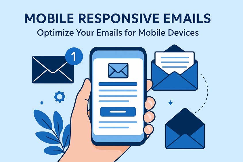
Why Mobile Responsive Emails Matter
In today’s fast-paced digital world, most people check their emails on smartphones. Whether during a commute, waiting in line, or between meetings, mobile devices have become the primary way users interact with email. This shift means that how your emails look and function on smaller screens directly impacts whether your audience engages with your content—or deletes it without a second thought. Mobile responsive emails are no longer optional; they are a necessity for businesses aiming to maintain strong connections with their audience.
Statistics underscore the importance of mobile optimization. Recent studies show that over 60% of email opens happen on mobile devices. Ignoring mobile responsiveness can result in misaligned images, tiny text that’s difficult to read, buttons that are impossible to tap accurately, and layouts that require endless scrolling. These issues frustrate readers and can significantly reduce your click-through rates and conversions.
Table of Contents
Mobile responsive emails adapt seamlessly to different screen sizes. Unlike traditional desktop emails that may appear broken or unreadable on a phone or tablet, responsive emails adjust their layout, fonts, images, and buttons so that every element remains clear and accessible. This adaptability ensures a smooth, consistent experience across all devices, which is essential for maintaining brand credibility and encouraging interaction.
Beyond aesthetics, mobile responsive emails directly affect performance metrics. For example, a well-optimized mobile email can increase open rates, improve engagement, and reduce bounce and unsubscribe rates. Readers are more likely to click links, engage with calls-to-action, and even forward the email when the experience is intuitive and visually appealing. Conversely, emails that aren’t optimized for mobile risk being ignored, leading to wasted effort, time, and resources invested in content creation.
The benefits of mobile responsive emails extend to branding and trust as well. When recipients receive an email that is easy to read and navigate, it conveys professionalism and attention to detail. Every element, from the header image to the CTA button, communicates a message about your brand. A poorly formatted email can create a perception of carelessness, which may discourage future engagement and even impact customer loyalty.
Moreover, mobile responsiveness is intertwined with accessibility. Many users rely on screen readers or other assistive technologies, and emails that adjust properly to mobile screens are often easier to navigate for these audiences. Ensuring that emails are both visually and functionally responsive is not just good business practice; it’s part of creating inclusive experiences that reach every member of your audience.
Designing mobile responsive emails is not just about shrinking content to fit smaller screens. It’s about understanding user behavior, prioritizing essential content, and delivering a smooth, enjoyable experience. Readers tend to skim on mobile devices, so concise copy, visually clear layouts, and prominently placed calls-to-action are critical. Attention spans are shorter, distractions are higher, and screens are smaller, meaning every word, image, and link must earn its place.
Implementing mobile responsive emails involves a mix of design, content strategy, and technical execution. Techniques include single-column layouts, adaptive images, appropriately sized buttons, legible fonts, and compressed multimedia. But the strategy goes beyond aesthetics. It requires analyzing metrics, testing across devices and email clients, and continuously optimizing based on user behavior. In essence, mobile responsive emails combine creativity, strategy, and technical precision to achieve maximum impact.
Another critical factor is that mobile responsive emails can improve ROI. Studies indicate that brands that prioritize mobile-friendly designs experience higher engagement, which translates into more clicks, conversions, and ultimately revenue. In industries like e-commerce, travel, and service-based businesses, even a small increase in mobile email performance can have a tangible effect on sales and customer retention. Every element of your email—from subject line to CTA—can be optimized to align with mobile behaviors, making every send more effective.
Finally, mobile responsive emails foster trust and loyalty. When recipients consistently receive well-formatted, easy-to-read emails, they are more likely to engage with your content regularly. They come to recognize that your brand understands their preferences and respects their time. This trust builds long-term relationships, encouraging repeat interactions and increasing the likelihood of conversion over time.
In summary, mobile responsive emails are essential in a mobile-first world. They improve readability, boost engagement, support brand credibility, enhance accessibility, and increase return on investment. Ignoring mobile optimization puts your campaigns at a disadvantage, while embracing responsive design ensures your emails look professional, function flawlessly, and connect with your audience effectively. By focusing on mobile responsiveness, you are not just sending emails—you are creating experiences that resonate with users wherever they are, on whatever device they use.
Understanding Mobile Email Behavior
Understanding how users interact with emails on mobile devices is the foundation of creating effective mobile responsive emails. Mobile users behave differently from desktop users in ways that impact how they read, click, and engage with content. To optimize emails for mobile, you must consider habits, challenges, and metrics that influence performance.
How Users Engage on Mobile
Mobile users are often multitasking, checking emails during brief pauses in their day—on public transport, waiting in line, or between meetings. Unlike desktop users, they are rarely sitting down to read in-depth content. This context shapes how emails are consumed: attention spans are shorter, and the focus is on quickly identifying whether an email is relevant or not.
Key behaviors to note include:
- Scanning over reading: Users tend to skim subject lines, preheaders, and headers to decide whether to open an email. Detailed paragraphs are often skipped unless the content is immediately engaging.
- Scrolling patterns: Vertical scrolling dominates mobile usage, and long, cluttered emails can lead to early abandonment. Single-column layouts or clearly segmented sections improve readability and retention.
- Tap interactions: Buttons and links must be appropriately sized for fingers. Too-small tap targets frustrate users and can result in missed clicks, even if the email is visually appealing.
Understanding these habits allows marketers to prioritize critical information, highlight calls-to-action, and reduce unnecessary content that slows decision-making.
Key Mobile Metrics to Track
Measuring performance is crucial for optimizing mobile responsive emails. While desktop metrics remain important, mobile-specific tracking provides insights into user behavior in real-world contexts.
Some essential metrics include:
- Open rates by device type: Tracking mobile versus desktop opens helps identify which segments are primarily using mobile. This can guide design and layout decisions.
- Click-through rates (CTR): Mobile clicks often differ from desktop clicks. Monitoring CTR by device ensures that links and buttons are effective for mobile users.
- Bounce rates and unsubscribes: Higher bounce or unsubscribe rates on mobile indicate potential issues with responsiveness, load times, or readability.
By analyzing these metrics regularly, you can pinpoint areas where mobile users struggle and implement design or content changes to improve engagement.
Challenges Unique to Mobile Emails
Mobile email design presents unique challenges that, if not addressed, can negatively impact performance. Being aware of these pitfalls helps you anticipate and avoid common mistakes.
- Tiny text and unreadable content: Fonts that are readable on desktop may appear too small on smartphones. Mobile users are unlikely to pinch-zoom or struggle to read small text, which can reduce engagement and clarity.
- Images not displaying correctly: Mobile devices and email clients sometimes block images by default or render them incorrectly. Using alt text, compressing images, and testing across devices ensures critical visual content is accessible.
- Long load times: Emails heavy with images, GIFs, or multimedia can load slowly on mobile networks. A slow-loading email risks losing user attention before the content is even visible.
Mobile User Context and Expectations
Understanding context is equally important. Mobile users often interact with emails in environments filled with distractions—commuting, waiting, or multitasking. Their expectations are straightforward: they want emails that are readable, quick to load, and easy to act on.
Consider these behavioral tendencies:
- Immediate relevance: Mobile users decide quickly if an email is worth their attention. Subject lines and preheader text play a critical role in this initial assessment.
- Action-oriented mindset: Many mobile email interactions are transactional or task-based. Users might click to make a purchase, RSVP, or download content, rather than browse passively.
- Frustration intolerance: Layout errors, unresponsive buttons, or poor readability lead to instant disengagement. Mobile users are quick to delete emails that don’t provide immediate value.
Leveraging Behavioral Insights
Marketers can use these behavioral insights to tailor mobile responsive emails effectively. For example:
- Prioritize key messages and CTAs: Place the most important content and call-to-action near the top of the email. Mobile users often abandon scrolling if they don’t immediately see value.
- Simplify content structure: Break long paragraphs into short, digestible sections. Use headings and bullet points to guide the eye.
- Optimize for touch interactions: Ensure buttons are large enough to tap easily, with sufficient spacing to prevent accidental clicks.
Additionally, segmentation can enhance mobile engagement. By identifying which users primarily open emails on mobile devices, you can tailor layout, design, and content specifically for that segment. This improves both readability and conversion rates, making your email campaigns more effective overall.
Real-World Examples
Consider a retail brand sending a promotional email. On desktop, they include a multi-column layout with large images, long product descriptions, and multiple calls-to-action. On mobile, this email may appear cramped, with images overlapping text and buttons that are difficult to tap. By redesigning the same email as mobile responsive, with a single-column layout, concise product descriptions, and prominent, finger-friendly buttons, the brand can dramatically improve mobile engagement.
Another example is a service-based business sending appointment reminders. Mobile responsive emails ensure that users can quickly read the appointment details, confirm or reschedule with a single tap, and navigate without frustration. Non-responsive emails in this context often lead to missed appointments and dissatisfied customers.
Summary of Best Practices
- Track device-specific metrics like mobile open rates and CTR.
- Design with scanning and scrolling behaviors in mind.
- Prioritize readability: clear fonts, concise content, and single-column layouts.
- Optimize images and multimedia for mobile screens.
- Ensure buttons and links are easily tappable.
- Consider the user’s context and environment to deliver quick, actionable value.
By understanding mobile email behavior, you can design and craft emails that naturally align with user expectations. Mobile responsive emails aren’t just visually optimized—they are behaviorally optimized, ensuring that your audience can engage effortlessly and effectively, wherever they are.
Designing Effective Mobile Responsive Emails
Design is the backbone of mobile responsive emails. Even the most compelling content will underperform if the design is cluttered, hard to read, or difficult to interact with on a mobile device. Mobile responsive email design combines aesthetics, usability, and technical execution to ensure that every element—text, images, buttons, and layout—works seamlessly across different screen sizes and devices.
Responsive vs Adaptive Design
Understanding the difference between responsive and adaptive design is essential for effective mobile email creation.
- Responsive design: This approach uses flexible layouts that automatically adjust based on the screen size. Content flows smoothly from large desktop monitors to small smartphone screens without breaking. Responsive design relies on CSS and flexible grids to ensure the layout adapts in real-time, making it the most widely used method for mobile responsive emails.
- Adaptive design: Instead of flowing dynamically, adaptive design uses predefined layouts for specific device categories. For example, one layout may be triggered for smartphones, another for tablets, and another for desktops. While adaptive design can offer highly tailored experiences, it requires more testing and maintenance to ensure each layout works correctly.
In most cases, responsive design is the best choice for mobile responsive emails because it provides consistent results across a wide range of devices and reduces the need for complex testing.
Simplifying Layouts for Mobile
Simplicity is critical in mobile email design. Mobile screens are small, so cluttered layouts and excessive elements can overwhelm users and lead to disengagement.
Key strategies for simplifying layouts include:
- Single-column layout: This layout ensures that content flows vertically, which aligns with natural scrolling behavior on mobile devices. Multi-column layouts often collapse unpredictably on smaller screens, breaking the design.
- Clear visual hierarchy: Use headings, subheadings, and spacing to guide the reader’s eye. Highlight important content and calls-to-action (CTAs) by placing them prominently near the top.
- Minimal distractions: Avoid excessive images, sidebars, or unnecessary decorative elements. Every component should serve a purpose.
- One primary CTA per email: Mobile users should know exactly what action to take without scanning multiple buttons. If secondary CTAs are necessary, make them subtle and lower on the page.
By focusing on a clean, structured layout, mobile responsive emails become easier to read, navigate, and act on.
Optimizing Fonts, Colors, and Buttons
Typography, color, and buttons are essential for usability and engagement on mobile devices. Small adjustments can dramatically improve the user experience.
- Font sizes: Minimum font sizes for body text should be 14–16 pixels to ensure readability without zooming. Headlines can range from 18–22 pixels, depending on hierarchy. Avoid using overly stylized fonts that reduce legibility on small screens.
- Color contrast: Ensure sufficient contrast between text and background. Mobile screens often display colors differently, and low contrast can make reading difficult in bright environments.
- Button sizing and spacing: Buttons should be at least 44×44 pixels with enough spacing around them for comfortable tapping. Place CTAs prominently above the fold when possible. Consider using contrasting colors for buttons to draw attention and guide action.
These elements are critical because users are more likely to abandon emails that are visually hard to read or difficult to interact with on a touchscreen.
Mobile-Friendly Images
Images enhance visual appeal but can also slow load times or break layouts if not optimized. Key considerations include:
- Image compression: Reduce file size without compromising quality to speed up loading. Tools like TinyPNG or ImageOptim can help.
- Flexible sizing: Images should scale according to screen size to prevent cropping or distortion. Responsive images adjust automatically to fit the device.
- Alt text: Always include descriptive alt text. Some email clients block images by default, so alt text ensures users understand the message even without visuals.
By optimizing images for mobile, you maintain visual impact while ensuring accessibility and speed.
White Space and Padding
White space, or negative space, is often overlooked but critical for mobile design. It improves readability, highlights important elements, and prevents the layout from feeling crowded.
- Adequate padding around text and buttons ensures that users can read content and tap elements accurately.
- Spacing between sections helps guide the eye and creates a clear content hierarchy.
- Margin consistency contributes to a professional, polished look across all devices.
Well-utilized white space can make a mobile responsive email feel open, clean, and easy to interact with, enhancing engagement without adding extra content.
Interactive Elements and Considerations
Some emails include interactive elements like sliders, collapsible sections, or animated buttons. While these can enhance user engagement, they require careful implementation on mobile:
- Test interactivity across devices: Not all mobile email clients support advanced HTML or CSS. Ensure fallback options display correctly.
- Use sparingly: Excessive interactivity can distract from the primary message or slow down loading times.
- Keep essential actions simple: Even with interactive elements, the core CTA should remain clear and easy to access.
The goal is to enhance, not hinder, the mobile experience.
Real-World Examples
Imagine a newsletter from an online clothing retailer. A poorly designed email on mobile might have side-by-side product columns, tiny “Shop Now” buttons, and a long intro paragraph. Users would have to zoom in and scroll horizontally—frustrating and time-consuming. A mobile responsive version would use a single-column layout, large, finger-friendly buttons, concise product descriptions, and a prominent CTA near the top. The result? Higher click-through rates, increased purchases, and happier subscribers.
Another example is a tech company sending a product update. Instead of embedding heavy images that slow down the email, they use compressed visuals, clear headlines, and a single CTA button linking to a detailed page. Mobile users can quickly scan and act without delay, improving engagement and satisfaction.
Summary of Best Practices
- Choose responsive design for broad compatibility.
- Simplify layouts using single-column designs and clear visual hierarchy.
- Optimize fonts, colors, and buttons for readability and touch interactions.
- Compress and scale images for faster loading and proper display.
- Use white space and padding to improve clarity and usability.
- Test interactive elements carefully and prioritize simplicity.
Designing effective mobile responsive emails is about balancing aesthetics with usability. By combining clean layouts, readable text, tappable buttons, and optimized images, you create emails that are both visually appealing and easy to navigate on any device. The result is higher engagement, better performance metrics, and an overall more satisfying experience for your audience.
Writing Content for Mobile Responsive Emails
Content is the heart of any email campaign, and when it comes to mobile responsive emails, writing must account for smaller screens, shorter attention spans, and on-the-go readers. Even beautifully designed emails can fail if the messaging is unclear, overly long, or difficult to interact with on mobile devices. Crafting effective content requires concise copy, strategic personalization, and clear calls-to-action that guide users seamlessly toward engagement.
Crafting Concise and Engaging Copy
Mobile users typically skim emails rather than reading word-for-word. This makes concise, focused messaging crucial.
- Short subject lines: Keep subject lines under 50 characters to ensure they display fully on most smartphones. A subject line should clearly convey value or urgency, enticing recipients to open the email. For example, instead of “Discover Our Latest Collection of Fall Outfits and Accessories for Every Occasion,” use “New Fall Styles You’ll Love.”
- Effective preheaders: Preheader text is often the second thing a recipient sees after the subject line. Keep it brief, informative, and complementary to the subject. Use it to provide context or reinforce urgency. For instance, “Limited-time offers on cozy sweaters and jackets.”
- Bite-sized body text: Break long paragraphs into short sentences and sections. Bullet points or numbered lists work well to convey key information quickly. Mobile users are more likely to engage with content that is scannable and easy to digest.
Engaging content doesn’t just inform—it motivates action. Use conversational language, ask rhetorical questions, and address the reader directly to create a sense of connection and immediacy.
Personalization and Segmentation
Mobile responsive emails perform best when they are relevant to the recipient. Personalization and segmentation are key strategies for achieving this.
- Dynamic content: Adjust content based on user behavior, purchase history, or preferences. For example, if a user frequently browses running shoes, feature new arrivals in that category instead of generic products.
- Device-based segmentation: Knowing which users primarily open emails on mobile allows you to tailor layout, CTA placement, and content length for their specific experience.
- Behavioral segmentation: Segmenting users based on past interactions, such as clicks, opens, or past purchases, allows you to send content that aligns with their interests and increases engagement.
By delivering content that resonates personally, mobile responsive emails become more effective, increasing click-through rates and fostering loyalty.
Clear and Actionable Call-to-Actions
The call-to-action (CTA) is the focal point of any mobile email. On smaller screens, clarity and accessibility are essential.
- Single, primary CTA: Avoid multiple competing CTAs above the fold. Focus on one main action that aligns with the email’s goal, whether it’s making a purchase, downloading content, or RSVPing to an event.
- Placement matters: Position the CTA where it’s immediately visible without scrolling. Mobile users are more likely to act when the action is obvious and accessible.
- Action-oriented language: Use concise, direct phrases like “Shop Now,” “Reserve Your Spot,” or “Get Your Free Guide.” Avoid vague commands like “Click Here” or overly wordy instructions.
- Button design: Ensure buttons are finger-friendly, with at least 44×44 pixels in size, sufficient padding, and contrasting colors that stand out against the background.
A well-placed, clear CTA can make the difference between a user engaging with your email or moving on. Mobile responsive emails require CTAs that are immediately actionable and visually prominent.
Formatting for Mobile Readability
Formatting plays a crucial role in helping mobile users consume and act on content quickly.
- Use headings and subheadings: Break content into sections with clear headings. This allows readers to scan and identify relevant information quickly.
- Short paragraphs: Keep paragraphs to 2–3 sentences. Dense blocks of text discourage mobile readers from engaging.
- Bulleted lists: Lists help highlight key points without overwhelming the reader. However, limit lists to one or two per email to avoid clutter.
- Highlight important information: Use bolding or color sparingly to emphasize key phrases, dates, or promotions without making the email visually chaotic.
These formatting strategies ensure that mobile responsive emails are easy to navigate, understand, and act upon.
Storytelling and Engagement
Even short mobile emails benefit from storytelling. Connecting emotionally with your audience increases engagement.
For example, a travel company sending a mobile email about a weekend getaway could start with a short, vivid anecdote: “Imagine waking up to the sound of waves and golden sunlight spilling into your room.” Following this, highlight key benefits and a single CTA to book now. Storytelling creates context, excitement, and motivation without requiring lengthy copy, which is perfect for mobile readers.
Testing Content for Mobile
Writing effective content for mobile responsive emails also involves testing. What looks good on a desktop may appear truncated or misaligned on a smartphone.
- Preview across devices: Use email testing tools to check how subject lines, preheaders, and body content appear on different screen sizes.
- A/B testing: Test variations of subject lines, CTAs, or even copy length to see which version resonates best with mobile users. For example, a subject line with urgency (“Ends Tonight: 20% Off”) can be tested against a curiosity-driven one (“Discover Your Perfect Fall Look”).
- Monitor engagement metrics: Pay attention to open rates, CTR, and conversions from mobile segments to refine your messaging continuously.
Real-World Examples
Consider an online fitness brand sending a mobile email promoting a new workout app feature. A mobile-friendly email could start with a short, engaging headline like “Track Your Progress Anywhere.” The body would use brief bullet points: “Log workouts in seconds,” “Set personalized goals,” and “Connect with friends.” A single, brightly colored “Download the App” button is positioned prominently. Non-mobile-friendly alternatives, with dense paragraphs and small CTAs, often see lower engagement and app installs.
Another example is an e-commerce brand sending a flash sale notification. By keeping the subject line short, preheader informative, product descriptions concise, and CTA prominent, mobile responsive emails can drive immediate conversions, even on small screens.
Summary of Best Practices
- Keep subject lines and preheaders concise and compelling.
- Break body text into short, scannable sections.
- Use dynamic content and segmentation for personalization.
- Focus on one clear, actionable CTA per email.
- Format content for readability with headings, lists, and bolding.
- Employ storytelling to engage users emotionally.
- Test copy across devices and iterate based on mobile metrics.
By crafting concise, personalized, and action-oriented content, mobile responsive emails can capture attention, encourage interaction, and drive meaningful results. The combination of strategic writing, thoughtful formatting, and clear CTAs ensures that your emails perform well on mobile devices and deliver a seamless user experience.
Optimizing Images, Media, and Load Times
In mobile responsive emails, visual content can make or break the user experience. While images, GIFs, and videos enhance engagement, they also introduce challenges: slow load times, broken layouts, and poor accessibility. Optimizing media and minimizing load delays are critical for ensuring that mobile users see, understand, and interact with your emails without frustration.
Image Optimization for Mobile
Images are powerful tools for storytelling and highlighting products, but without proper optimization, they can hinder performance.
- Compression without losing quality: Large image files increase load times, which frustrates mobile users who are often on slower networks. Compress images using tools like TinyPNG, ImageOptim, or Photoshop’s “Save for Web” feature. Aim for images under 200 KB whenever possible without sacrificing clarity.
- Flexible sizing: Mobile screens vary in width and resolution. Use responsive image techniques that allow visuals to scale dynamically. Images should adjust to fit the screen without cropping essential content or distorting proportions.
- Alt text inclusion: Some mobile email clients block images by default. Alt text ensures users understand the message even if images do not load. For example, a product image could have alt text: “Red running shoes – lightweight and breathable.”
Properly optimized images ensure that mobile responsive emails are visually compelling, load quickly, and remain accessible to all users.
Using Multimedia Wisely
Beyond static images, multimedia can boost engagement, but excessive or poorly implemented media can harm the mobile experience.
- GIFs: Animated GIFs can draw attention to key messages or promotions. Keep them short, loop sparingly, and compress for fast loading. Use them to highlight CTAs or showcase product features without overwhelming the email.
- Videos: Embedding video directly in an email is often unreliable, as many mobile clients do not support playback. Instead, use a static image with a play button overlay linking to the video on a landing page. This ensures compatibility while retaining engagement potential.
- Alternatives to heavy media: CSS animations or small, lightweight animations can convey movement or interactivity without significantly increasing email size. Avoid overly complex interactive features that may fail on certain devices.
The key is balancing engagement with practicality. Multimedia should enhance, not hinder, the mobile experience.
Enhancing Email Load Speed
Mobile users expect instant access to content. Long load times lead to frustration and increased email abandonment. Speed optimization should be a core consideration in mobile responsive emails.
- Limit total email size: Aim for emails under 100 KB when possible. Minimize heavy images, embedded fonts, and unnecessary code. Smaller emails load faster and display correctly across clients.
- Reduce external assets: Relying on externally hosted images or scripts can delay rendering. Use inline CSS and host images on fast, reliable servers to ensure consistent load times.
- Test load times: Before sending, preview emails on multiple devices and networks. Check how quickly images render, buttons load, and content becomes readable. Consider throttled mobile network simulations to replicate real-world conditions.
Focusing on speed ensures that mobile users engage with the email before losing interest or deleting it.
Mobile Accessibility Considerations
Accessibility is a critical aspect of optimizing mobile responsive emails. Images and media should support all users, including those with disabilities or assistive technologies.
- Readable alt text: Alt text is essential for screen readers and ensures users understand the message even if images are blocked.
- Contrast and color usage: Ensure sufficient contrast between text, buttons, and backgrounds. This benefits users in bright environments and those with visual impairments.
- Avoid overly complex media: Avoid multimedia that relies solely on visuals or gestures that may not be accessible. Ensure key information is conveyed through text or clear CTA buttons.
Accessible mobile responsive emails reach more users and create a better overall experience for everyone.
Real-World Examples
Consider an e-commerce brand sending a mobile email promoting a holiday sale. A non-optimized email might include large, uncompressed images of multiple products, resulting in slow load times and awkward vertical scrolling. A mobile optimized version compresses images, reduces the number of visuals above the fold, and replaces embedded video with a linked thumbnail. The result: faster loading, clear presentation, and higher click-through rates.
Similarly, a travel company announcing a last-minute trip deal can use a compressed hero image, a small GIF highlighting the promotion, and a single, prominent “Book Now” button. Even on slow connections, mobile users immediately see the offer and can act without delays.
Testing Media Across Devices
Testing is essential to ensure media displays correctly across the multitude of mobile devices and email clients.
- Preview on multiple devices: Check layouts on iOS, Android, tablets, and smaller-screen smartphones. Look for broken images, misaligned content, or buttons that are difficult to tap.
- Check email clients: Gmail, Outlook, Apple Mail, and other clients render images differently. Test emails to confirm consistency.
- A/B testing: Compare engagement with different image sizes, GIFs versus static images, or video links to identify which approach performs best for your mobile audience.
Testing allows you to optimize media effectively, ensuring emails remain functional and engaging on all devices.
Summary of Best Practices
- Compress images to reduce file size without sacrificing quality.
- Use responsive images that scale for various screen sizes.
- Include descriptive alt text for all visuals.
- Use GIFs and videos sparingly; link videos instead of embedding when necessary.
- Limit email size and reduce reliance on external assets for faster load times.
- Test media and layout across multiple devices and email clients.
- Ensure accessibility through contrast, alt text, and simplified multimedia.
By optimizing images, media, and load times, mobile responsive emails provide a seamless, visually appealing experience for recipients. Fast-loading emails with well-compressed visuals and accessible media increase engagement, reduce frustration, and improve overall campaign performance.
Testing and Analytics for Mobile Responsive Emails
Creating mobile responsive emails is only half the battle. Testing and analyzing performance are essential for ensuring that your emails work across devices, engage your audience effectively, and drive results. Without careful testing and monitoring, even the most well-designed emails may fail to reach their potential. Understanding how users interact with your emails, identifying issues, and refining campaigns based on data are critical steps in optimizing mobile responsive emails.
Pre-Send Testing
Testing emails before sending is the first step in ensuring mobile responsiveness. Even minor design or formatting errors can cause frustration and reduce engagement on mobile devices.
- Device previews: Check how emails appear on different screen sizes, including smartphones, tablets, and desktop monitors. Consider using emulators or email testing tools to simulate various devices.
- Email client compatibility: Different email clients render emails differently. Test emails on Gmail, Outlook, Apple Mail, Yahoo Mail, and other popular clients to ensure consistent appearance and functionality.
- Functionality checks: Verify that all links, buttons, and interactive elements work as intended. Test forms, CTAs, and navigation elements to confirm usability on touchscreens.
Pre-send testing ensures that mobile responsive emails display correctly, function properly, and maintain brand consistency across devices.
A/B Testing for Mobile Optimization
A/B testing is a powerful way to optimize mobile responsive emails. By comparing different versions of an email, you can identify what resonates best with your audience and make data-driven improvements.
- Subject lines and preheaders: Test variations in length, tone, and urgency. For instance, compare “Don’t Miss Our Fall Sale” with “Last Chance: 50% Off Fall Items” to see which drives higher open rates on mobile.
- CTA placement and design: Experiment with different button positions, colors, and sizes. Mobile users may respond better to CTAs placed above the fold or emphasized with contrasting colors.
- Content layout: Test single-column layouts versus alternative structures, or compare short vs. longer copy. Determine which format leads to higher engagement and conversions on mobile devices.
- Images and media: Evaluate performance of static images versus GIFs or video thumbnails. Monitor which media type loads faster, engages users, and encourages clicks.
A/B testing enables continuous refinement of mobile responsive emails, helping you maximize engagement and performance.
Interpreting Analytics
Once emails are sent, analyzing performance data is essential to understand user behavior and inform future campaigns. Mobile-specific metrics provide insights into how users interact with emails in real-world contexts.
- Open rates by device: Track which percentage of recipients open emails on mobile versus desktop. A high mobile open rate indicates the importance of optimizing content and design for smaller screens.
- Click-through rates (CTR): Measure how often recipients click links or buttons on mobile devices. Low CTR on mobile may indicate issues with CTA visibility, button size, or content relevance.
- Conversion rates: Track completed actions, such as purchases, downloads, or sign-ups, from mobile users. Comparing mobile and desktop conversions helps identify gaps in mobile experience.
- Bounce rates and unsubscribes: Elevated bounce rates or unsubscribes from mobile users may signal technical problems, unreadable content, or overly complex layouts.
Interpreting these analytics allows you to make informed adjustments to your mobile responsive emails, improving usability and engagement over time.
Continuous Improvement Through Data
Testing and analytics are not one-time tasks—they are part of a continuous optimization process. Every campaign provides valuable data to refine mobile email strategies.
- Iterate on content and design: Use insights from open rates, CTR, and conversion metrics to adjust subject lines, copy length, images, and button placement.
- Monitor trends over time: Track changes in mobile engagement across campaigns to identify patterns, preferences, or new device behaviors.
- Personalize based on behavior: Use analytics to segment users based on how they interact with mobile emails. Tailor future content to maximize relevance and engagement.
- Benchmark against industry standards: Compare your mobile email metrics with industry averages to identify strengths and areas for improvement. For example, average mobile email open rates vary by industry but generally range between 15% and 25%.
By treating testing and analytics as an ongoing process, mobile responsive emails continually evolve to better meet audience expectations and drive stronger results.
Real-World Examples
A retail brand recently launched a mobile-responsive email campaign promoting a new product line. Pre-send testing revealed that their buttons were too small for easy tapping on iPhones. After resizing and increasing spacing, A/B testing showed a 22% increase in mobile CTR. Analytics further indicated that users preferred images with concise captions over long descriptions, prompting a permanent adjustment in content strategy for future campaigns.
Similarly, a travel agency sending mobile emails for last-minute deals used A/B testing to compare two subject lines: “Book Your Weekend Getaway Now” versus “Limited Spots Left: Weekend Escape.” The latter drove 18% higher mobile open rates, illustrating how small adjustments informed by testing can yield significant results.
Best Practices for Testing and Analytics
- Test emails on multiple devices, screen sizes, and email clients before sending.
- Conduct A/B tests for subject lines, CTAs, content layout, and media.
- Monitor mobile-specific metrics: open rates, CTR, conversions, bounces, and unsubscribes.
- Iterate and refine campaigns based on data, continuously improving performance.
- Segment audiences using behavioral insights from mobile interactions to personalize content.
- Compare performance against industry benchmarks to identify opportunities for optimization.
Testing and analytics transform mobile responsive emails from static content into data-driven, high-performing campaigns. By identifying what works, refining strategies, and iterating consistently, marketers can maximize engagement, conversions, and overall ROI.
Maximizing the Impact of Mobile Responsive Emails
Mobile responsive emails are no longer an optional part of a digital marketing strategy—they are essential. With the majority of email opens occurring on smartphones and tablets, creating emails that look great, load quickly, and are easy to interact with on mobile devices directly influences engagement, conversions, and overall campaign success. Throughout this article, we’ve explored how understanding user behavior, designing effectively, crafting concise content, optimizing media, and leveraging testing and analytics all contribute to high-performing mobile responsive emails.
The core principle behind mobile responsive emails is adaptability. Every element—layout, text, images, buttons—must adjust seamlessly to different screen sizes. This adaptability ensures users receive a consistent, intuitive experience, whether they are checking emails on a tiny smartphone, a medium-sized tablet, or a desktop. A mobile-responsive design eliminates frustration caused by tiny fonts, broken layouts, or hard-to-tap buttons, making it easier for recipients to engage with content and take action.
Design and layout are the first points of impact. Clean, single-column designs, ample white space, clear visual hierarchy, and prominent, finger-friendly buttons help readers navigate content effortlessly. Mobile users scan quickly, so prioritizing key messages and placing the main call-to-action above the fold can significantly improve click-through rates. Even small adjustments—resizing fonts, increasing button spacing, compressing images—can make a substantial difference in usability and engagement.
Equally important is the content itself. Writing for mobile requires concise, action-oriented copy that immediately communicates value. Short subject lines, informative preheaders, and scannable body text keep readers’ attention, while personalized and segmented content makes emails more relevant. Clear and compelling calls-to-action guide recipients to act without confusion. Every sentence, every word, and every CTA in a mobile responsive email should serve a purpose, ensuring the user can engage quickly and effectively.
Images, GIFs, and videos play a key role in capturing attention but must be optimized for mobile. Compressed images, flexible sizing, descriptive alt text, and thoughtful use of multimedia prevent slow load times and broken layouts. Linking videos instead of embedding them ensures compatibility across mobile email clients. Fast-loading, visually appealing emails retain attention, reduce frustration, and improve engagement metrics.
Testing and analytics are the final pillars of success for mobile responsive emails. Pre-send testing across devices and email clients ensures that emails appear correctly and function as intended. A/B testing allows marketers to identify which subject lines, CTAs, images, or layouts resonate most with mobile users. Mobile-specific analytics—open rates, click-through rates, conversions, and bounce rates—provide actionable insights to refine future campaigns. By continuously testing, analyzing, and iterating, mobile responsive emails evolve to meet changing user behaviors and device technologies.
The benefits of investing in mobile responsive emails are tangible. Marketers often see higher engagement, improved click-through rates, and better conversion metrics compared to non-optimized emails. Well-designed mobile emails foster trust and credibility, enhancing brand perception and encouraging long-term customer loyalty. They also support accessibility, ensuring that users with varying needs and assistive technologies can interact with content effectively.
Real-world examples illustrate the impact. A retail brand that resized buttons, simplified layouts, and compressed images for mobile saw a 22% increase in click-through rates. A travel agency that used targeted subject lines, concise copy, and a prominent CTA experienced higher mobile open rates and more bookings. These examples show that mobile responsive emails are not just about aesthetics—they directly affect user engagement, business outcomes, and return on investment.
Implementing mobile responsive emails requires attention to detail and a willingness to iterate. Marketers should view every campaign as an opportunity to learn and refine. By combining thoughtful design, concise and relevant content, optimized media, and rigorous testing, businesses can deliver emails that are visually appealing, easy to interact with, and highly effective.
In practice, maximizing the impact of mobile responsive emails involves a few key actions you can take immediately:
- Audit current email templates for mobile responsiveness and identify areas for improvement.
- Simplify layouts, prioritize key messages, and ensure CTAs are prominent and touch-friendly.
- Compress and optimize images while including descriptive alt text for accessibility.
- Keep copy concise, engaging, and tailored to the audience through personalization and segmentation.
- Test emails across multiple devices and clients before sending to ensure consistent performance.
- Analyze mobile-specific metrics after each campaign to inform improvements for future sends.
By following these steps, you ensure that every email not only reaches your audience but also engages them effectively, driving desired outcomes. Mobile responsive emails transform the user experience from a frustrating or passive interaction into an actionable, enjoyable, and memorable engagement with your brand.
In a mobile-first world, businesses that invest in creating, optimizing, and testing mobile responsive emails gain a competitive advantage. They demonstrate that they understand their audience’s needs, value their time, and provide content that is both accessible and compelling. The result is higher engagement, stronger brand loyalty, and better overall performance for email marketing campaigns.
Mobile responsive emails are more than just a design consideration—they are a strategic tool. When executed effectively, they ensure that your messages reach the right people, in the right way, at the right time, maximizing impact and return on every send.

Gabi is the founder and CEO of Adurbs Networks, a digital marketing company he started in 2016 after years of building web projects.
Beginning as a web designer, he quickly expanded into full-spectrum digital marketing, working on email marketing, SEO, social media, PPC, and affiliate marketing.
Known for a practical, no-fluff approach, Gabi is an expert in PPC Advertising and Amazon Sponsored Ads, helping brands refine campaigns, boost ROI, and stay competitive. He’s also managed affiliate programs from both sides, giving him deep insight into performance marketing.